This is the second of three installments about my 3 favorite sets from the '80s. The fourth installment will be about my 3 least favorite sets.
Once again, this won't be a deep dive into the sets, but will hopefully be a little informational and a bit of opinion. The 3 favorites are not ranked in any order, just like my 3 least favorites won't be either. I'm also sticking to Topps base sets. It's not like that's all I collected back then. I have tons of Fleer and Donruss cards that I collected in the '80s, but my focus these days is on Topps so that's what I'm sticking to for now.
One of my favorite sets from the 1980s is the 1984 Topps set.
The 1984 Topps set was released in one series, as best as I can tell, in April of '84. This 792 card set is very similar in design to the '83 set. Like it's predecessor, the '84 set has a large action shot with an inset portrait, but differs in that the inset portrait is in a square set in the bottom left corner and the team name, in block letters, runs vertically down the left side of the card. The backs of the cards have a blue border with red and blue text. There are 93 rookies in the set. The top two rookie cards are the Don Mattingly and Darryl Strawberry rookie cards.
I remember when I was opening packs and pulled both of these cards. Isn't it an awesome feeling when opening packs and you pull the card you've been looking for? I love that feeling.
The first six cards of the '84 set are the 1983 highlights.
Two really cool cards that honor the history of the game. First 3 pitchers in one year surpassing Walter Johnson...what a cool part of history. Second, three HOFs all retiring at the same time. Great way to honor their contribution to the game with a card.
Cards 131 to 138 are the League Leaders cards.
I really like these cards because they show some of the history of year and as I go through the set, I'm reminded about who the league leaders of that time were.
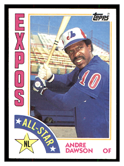
Cards 386 to 407 are the All-Star cards.
I've never been a big fan of the All-Star cards. I really like the way it was done in '79 and '80. That being said, I do like the design of the '84 cards. I think it's the team name on the left side.
The last subset in the '84 set is the NL/AL Active Career Leaders cards numbered 701 to 718.
I think this is a super cool subset. I love the quick reference to those players who are moving up the ladder of career stats. These cards are great examples; 5 HOFs and one that had a huge impact on baseball.
Here's a few more of my favorite cards.
I really think the action shots are so much better in the '84 set. The Jackson card is one of my favorites. I think its the colors, that classic Reggie swing, just a cool card.
I am a big fan of the manager cards. I always liked Billy Martin as a manager. I think it was his fiery demeanor and his willingness to argue to defend his players. Frank Robinson is, in my opinion, an underrated HOF'er. I'm not saying he doesn't get recognized as great, but I believe he was better than some of the others that get more recognition.
I love the action shots that have the ball in them. The ball makes the shot seem realistic to me.
This one of my favorites. Not so much because it's Rupert Jones, because of the shot of the hitter and catcher. Cool pic.
I had a hard time trying to decide between the '83 and the '84 sets. Very similar sets as far as design goes and I didn't want 2 of my 3 favorites to look so much alike that I had to choose one(spoiler alert! 1983 won't be my next pick). I went back and forth between the two. First, I was leaning to '83 set mainly because of the rookie cards of Tony Gwynn, Wade Boggs and Ryne Sandberg.
The more I looked at the set, which I still really like, I kept finding things that I didn't like as much as I did of the '84 set. For instance, the All-Star cards. I don't like the star design on the card. The star is too big and the font of the All Star looks like it was a last minute add to the design. The '84 design is better.
Another thing that I noticed as I went through the sets, the '83 set seemed to have more posed "action" shots. That's not to say there aren't any "posed" action shots in the '84 set. As I was going through both sets I found that there are more than double of the posed "action" shots in the '83 set as compared to the '84 set.
That's enough comparing the '83 and the '84 sets. Let me know what your thoughts are on my choice!
Peace,
Michael
Isaiah 40:31


I like 83 & 84 Topps sets. I'd have to say equally as they are the only two sets by Topps that I did and do like. Didn't like the 80, 81, 82 was okay, 85, 86, 87, 88 was so so, and 89. 83 & 84 definitely the best of the decade.
ReplyDelete👍
ReplyDelete